Your domain management page has been redesigned
 Sebastian Hermida
on
Sebastian Hermida
on
TL;DR Your domain manage page should show you the most important details of your domain and make it easy to make changes. We've redesigned the page to make it easier to use.
A few weeks ago, we started to work to refine and improve the internal UI for managing your domains. We recognize that some tasks are harder to accomplish than others, and for new customers, some of our screens can be overwhelming with their many options.
Our goal is to simplify and declutter the application without removing the power features that you use and love. We don't want to radically change everything, we simply want to make it easier for you to accomplish common tasks quickly.
Our first stop on this journey is the domain page.
There where a few issues with the previous version of this page (screenshot below). The bigger ones included:
-
All sections had the same importance on the page. Sections like Services and DNS records make sense to be highlighted and clear, because they are often the ones that you use. Other sections, like Domain API token and Danger Zone (deleting your domain), don't deserve to be as visible. You probably don't use them as much, if at all.
-
The Tasks section was a dumping ground for things that didn't fit anywhere else. Some of them were not even related to each other. These tasks should be more obvious to find and to perform.
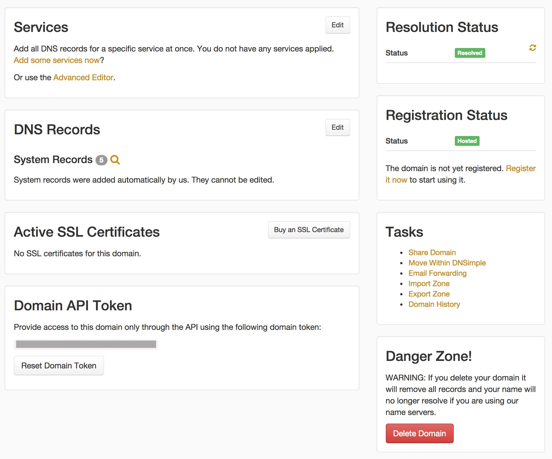
The previous manage domain page
With this in mind, we iterated through a few design with one goal: Regroup the information so it makes better sense for the actions that you want to accompish.
We started on paper, drawing some concepts and different approaches to classify the data on the screen.

Fun with paper
Moving quickly to low-medium fidelity wireframes

An approach for what could have been a dashboard
And finally shipped this:
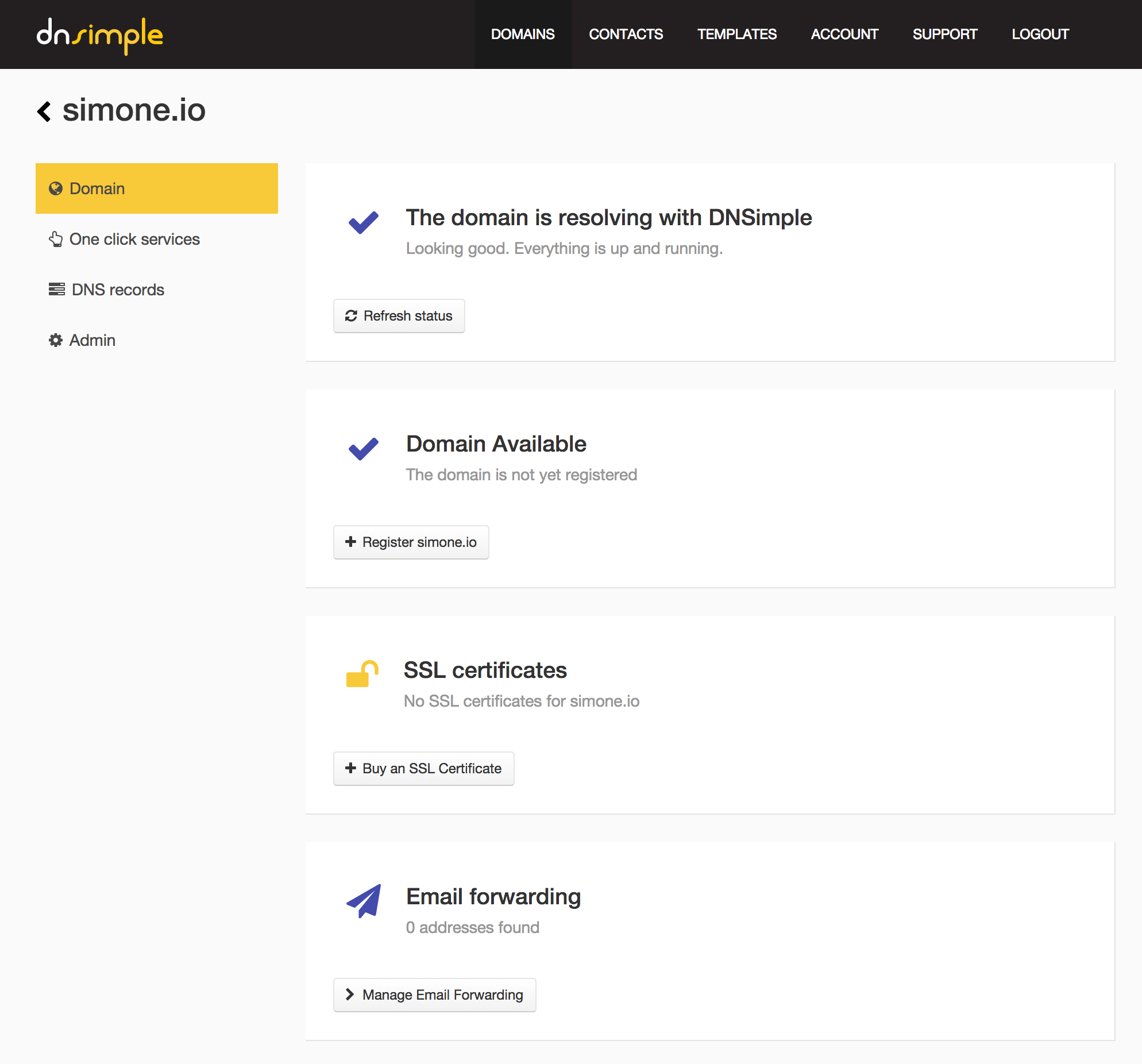
New manage domain page
Aaah…everything in its right place.
From the sidebar, you can jump into adding one-click services, DNS records or handle some of the less common administrative tasks of the domain. Each page is organized as a set of cards, logically grouping together functionality.
We think this is a significant improvement over what we had before. Information and actions should be easier to understand and perform. We hope you think so as well.
Tell us what you think by emailing support@dnsimple.com - we look forward to your feedback. We will continue improving the UI on other pages as well, and are working hard to make your experience with us as smooth and as easy as possible. We are pretty pumped about making DNS simple for everyone.
Cheers.
Sebastian Hermida
Appreciates the finest things in life: clean code, good illustrations and carrot juice. Someday he will run a marathon.
We think domain management should be easy.
That's why we continue building DNSimple.