Perspective switch, the first step towards a good UX
 Maria Munuera
on
Maria Munuera
on
We tend to imagine our users based on ourselves. Well, ourselves in laboratory conditions.
Reality is messy, users get distracted. Users bookmark pages we didn't predict. Users don't visit your website starting from the homepage. Not anymore. Users don't use your app as you planned, because users have a thousand other things in mind when they get to any particular form.
Stop assuming users are totally focused on their screens, with only one tab open, no music, and alone. People have cats, and coworkers, and mobile and desktop notifications.
Not to mention the diversity of technology knowledge, and the different purposes when using your product.
Help! My features have eaten my product
One common situation when developing a product for years is the Frankenstein Monster Effect, a.k.a. a product that has grown organically tends to be shaped by its features. Even the most scalable product needs to be revamped from time to time. Products grow and the context in which they were created changes with time.
To overcome this effect we need to rethink the product as a whole, and from the outside.
Changing your perspective
When you are part of a product-oriented team, you get to know how everything was built. You know the app inside out. Looking at it as a user does for the first time is no easy task. Inherited assumptions are our enemy.
Imagine these two scenarios:
A. Unlock your iPad with your finger and tap an icon.
B. Turn on your computer, enter your password, open one folder, open another folder, and open one file.
Both processes get you to the same point, but only the second one requires a previous knowledge by the user–where is that file located in the system–. That's why iPads are so popular in our parents' generation. They don't need extra time to figure out how it works or how it's built.
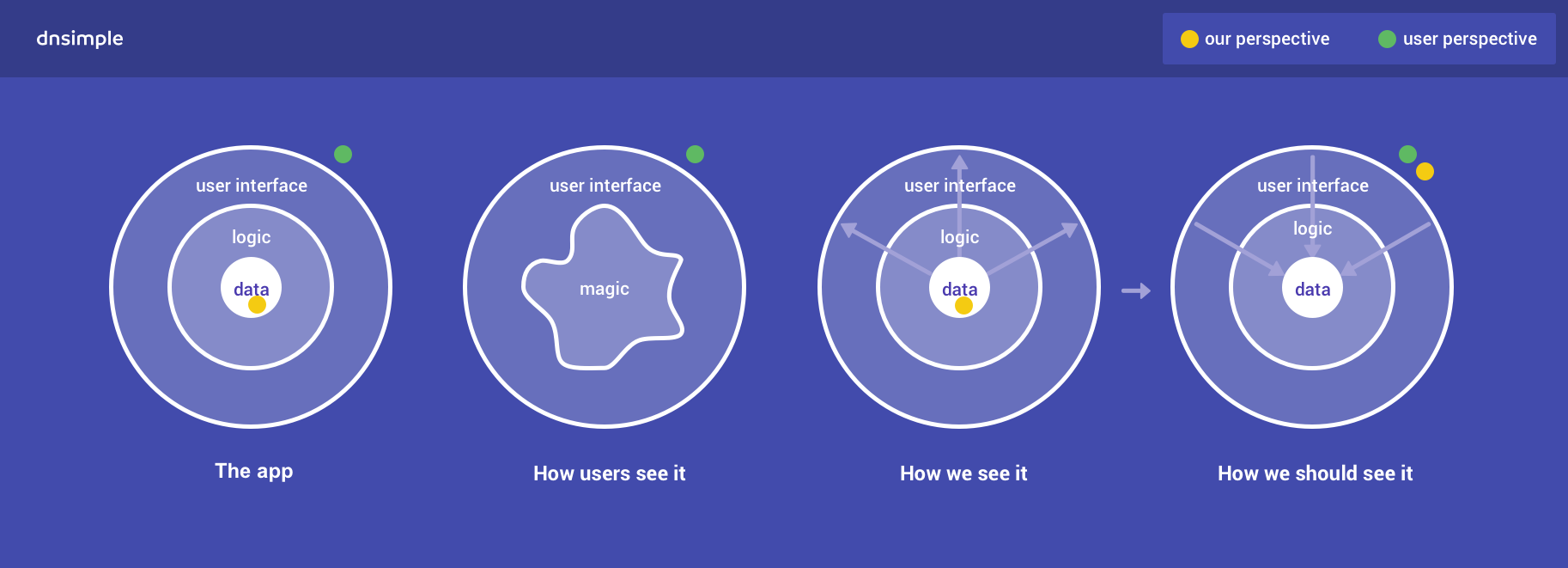
Our challenge is to create a product from the users perspective, even if we know what's behind the curtain.
In the words of Peter Merholz: "Our users see the user interface and everything else is magic. We spend all of our time obsessing with data and logic but users don't care."
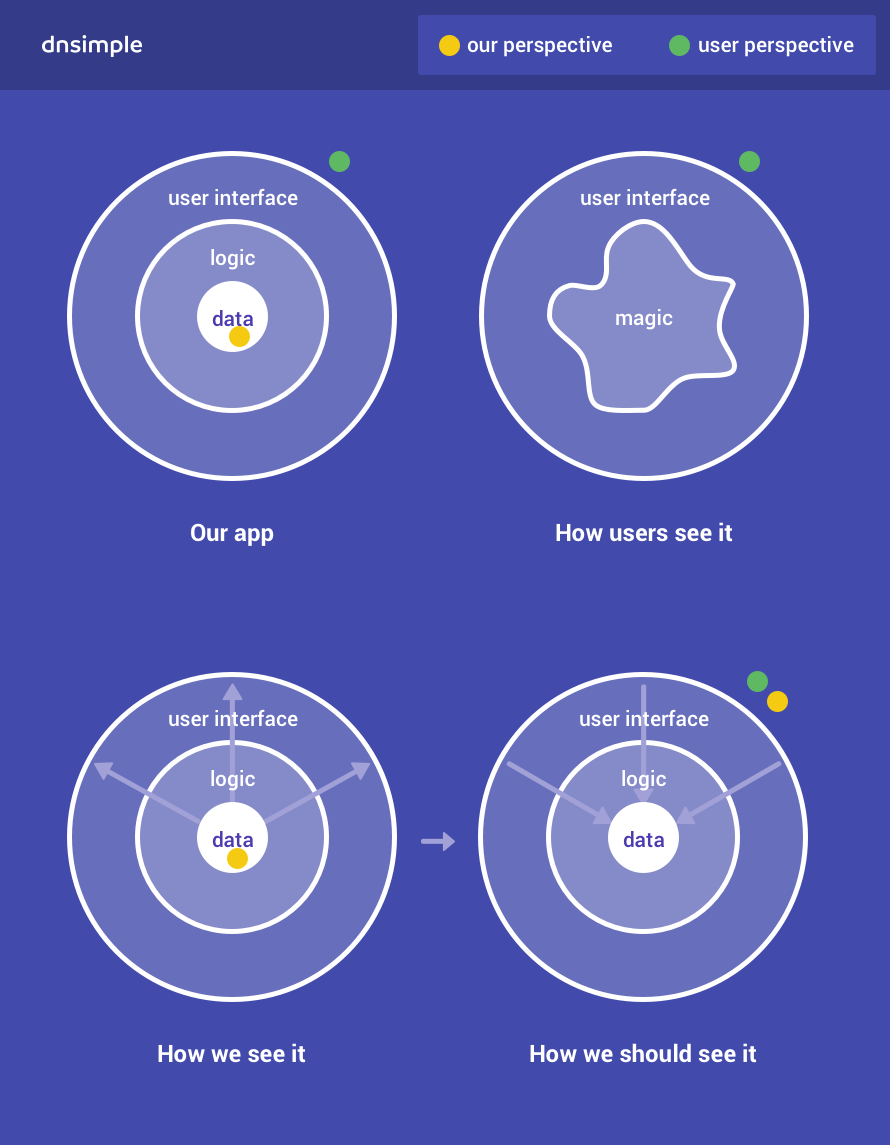
The idea is to go from how do we get this feature out into the world to what are users trying to accomplish and how do we change what we are doing to anticipate that behavior.
Perspective switch in action
This is one example in that direction. The image below shows the form to add a CNAME record.
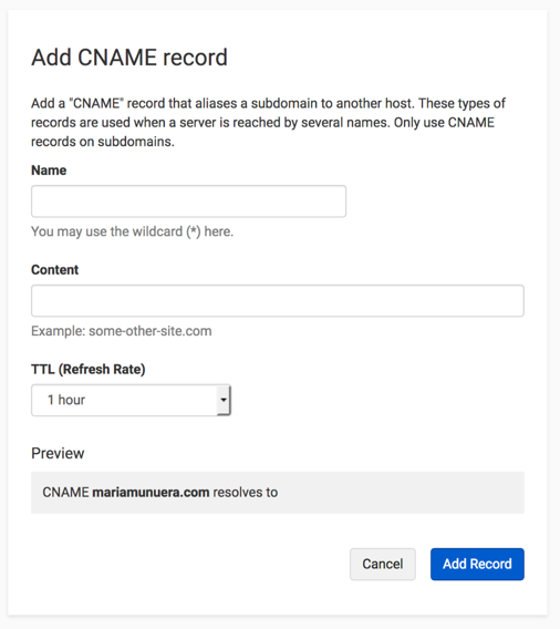
Could you enhance the experience in any way? Hint: try thinking from a human perspective, not the data structure.
CNAME records can be used to alias one name to another. You can redirect www.yourdomain.com to yourdomain.com. We also offer the possibility of redirecting every single subdomain that doesn't exist to the main domain. For example whatever.yourdomain.com will show yourdomain.com.
There are two fast fixes:
Preventing errors
Even with a preview at the bottom, the most common mistake in this form is the user thinking they need to rewrite the entire domain. So people end up creating a record called www.mydomain.com.mydomain.com. Thankfully, records are easy to delete and create in DNSimple.
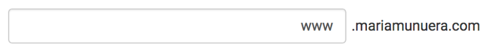
Avoiding the double domain error, saving user's time and their working memory can be achieved by adding the domain at the end of the field and aligning the text to the right. The user will see the entire URL like they usually read it.
Translating to human language
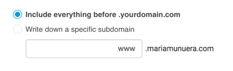
We offer the possibility of adding everything-before-this.yourdomain.com. Right now, this is activated by the user writting an asterisk and a point to the field *.. The instructions are right below the first field. It is not difficult to understand, but it's an extra second to think and another extra second to act. Instead of writing something down, even if it's just an asterisk, perhaps it is better to use a chekbox or radiobutton for this? It's an ON/OFF kind of question, so it can be answered with a switch.
I've also changed the copy to sound more human like.
Conclusions and resources
The experience is the product. Look at your app from the user's perspective. Put yourself in their shoes.
The goal of this perspective switch is not only offering a better experience overall, it's also easing the learning curve and getting to a wider audience.
Resources
The experience is the product graph
Printable–black and white–the experience is the product graph
Maria Munuera
Avocado lover. She would have been born remotely if she could
We think domain management should be easy.
That's why we continue building DNSimple.


