Why we redesigned our header
 Maria Munuera
on
Maria Munuera
on
Thanks to the heuristic evaluation, customer journey insights, and other work done in the past few months, we now know more about our users behavior, goals, and problems than before.
Our journey to a new header
One of the problems we identified is the confusion between User and Account. A DNSimple User can have multiple Accounts. That dependency has confused our users for a long time.
Being a solid business we don't want to make big changes just because, and we often look for the tiniest possible adjustments to solve problems. In this case, we were asking the wrong––or incomplete––question. We were wondering why User and Account weren't clear enough concepts.
Asking the right question
Instead of immediately trying to answer 'why isn't the copy clear?' we started digging on our database to learn our users behavior towards this feature. We wanted to know how our users are using that feature.
As an eight year old product we have access to the real usage of our features through time. Thinking about how to solve a problem is easier if you know the potential impact of changes.
Data informed design, not data driven design
I've based the new design on the data we extracted from our current users, but not only that. We can't forget we only have quantitative data, not qualitative. People are biased by their context and some user's behavior could be influenced by the application itself.
For example, we could say people don't edit their Facebook Privacy Preferences enough and therefore they aren't interested in privacy, but we also know that Facebook Pirvacy settings are currently overcomplicated and hidden. Data driven design would only listen to the first argument, while data informed design considers specific data and context together.
Looking at DNSimple account feature usage we discovered Anthony is the user with more accounts at seven. We also learnt 96% of our users have only one account. How could users tell the User-Account dependencies when they have only one of each and by Internet standards both words are used as synonyms?
Designing for the most probable scenario
A useful design is expected to serve at least 80% of the users. Good UX design is thought-out for the most probable scenario, not for all possible ones.
Good UX design is thought-out for the most probable scenario, not for all possible ones.
Changing the header is not an aesthetic decision, but a functional consideration. Form follows function.
If we look at the current header, this is how 96% of our users see it––96% have only one account––:
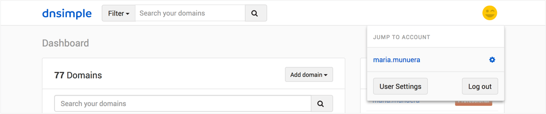
We read from top to bottom. That's how we perceive dependencies. In the current UI we display Account over User, when User is hierarchically over Account.
The lack of color and size differences don't help differentiate them either.
We also had a link displayed as a button: User Settings is not a button because it doesn't trigger any action. If I'd fixed just the link, we would had ended up with an even more homogeneous menu.
Form follows function means we need to see what's needed, how much of it is needed (bigger things look more important or higher in hierarchy in our minds), and what's not, and then we can decide what shape it will take to make clear the concepts we want to display.
If almost everyone sees only one account, why don't we display that account integrated with the rest of the app, with a displayed hierarchy––parents on top of children––?.
Creating two headers
I started thinking about doing only one header, but it was made to fit the content of the 4% of our users. The rest will have an extra unnecessary row. We weren't letting 96% of our users view the best version of the app for them.
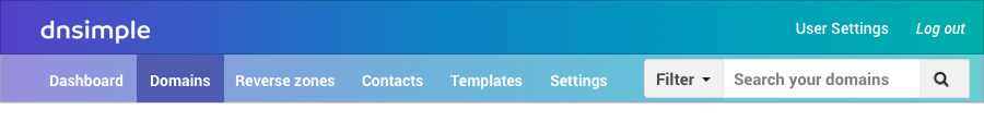
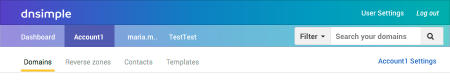
These are the two versions of the new header: the first one is shown for users with one account, and the bottom one for users with more than one account.
Simone asked me why don't we follow Google design and include an 'Add account' button right next to the account: that button is already easy to find and rarely used. Google and other products have an Add account very handy because their main product––or differentiation value––is having accounts. It's also because of their constraints. Google has to display that kind of dropdown menu and account selection in one hundred places, so they decided to create the less bad option. They use a design system throughout a wide array of products. For example, because the design system must be useful for very different products, if someone wants to delete an event from the mobile calendar, they have the user tap on a dropdown menu with just the Delete option. I'm not saying we shouldn't look at Google designs, rather that Google's context is very different from ours.
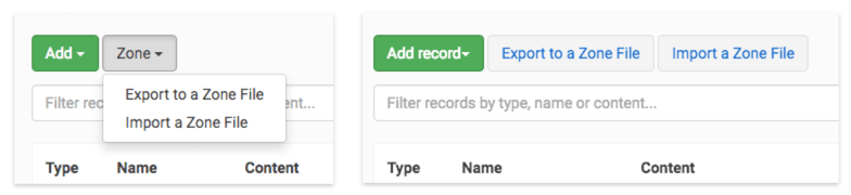
Getting rid of the drop down menu
We shouldn't use drop-downs for less than three or four options if we could display the options right there, or even better, in their context of usage. We should spare one step–or one click–when we can and it fits our purpose of a better user experience.
We have made this change in the past, in the Records page, changing a two item dropdown to two displayed buttons.
The default will still be a two rows header. I've designed the third one to fit the content for the 4%, including us.
Changing colors
We don't have a three row header anywhere. I needed to create a third row. If I'd followed our current style, the three lines would have been white.
We can show hierarchy of content using size, white space around it, color, etc.. I've chosen color because it also helps "closing" visually the top of the page.

Design is made in context, not in a void. Most browsers have a light gray top bar. That means our app blended with the browser's menu. A darker header makes it clear for the eye 'when does this page starts'.
Color also helps users separate the header from the rest of the page.
 Vignetting effect example, cc gallery wocintechchat
A darker color on top and at the end of the page tells us when the content starts, like the vignetting effect in in the picture above. Surrounding the page helps the user focus, it says 'Here's where you have to look'.
The user can focus on the content OR the header because they are different colors. They will no longer be visually at the same level.
If the goal was to make the dependencies between account and user clearer, then we should highlight their hierarchy differentiation.
The third row is the same height as the others because color already displays hierarchy, we don't need to add a size variation.
It is always a good idea to repeat sizes and angles because of consistency and vertical rhythm.
Using gradients and pop culture influence on taste
We could use a dark blue on the top row and our default blue for the second one instead of a gradient, and in fact I did in the first draft of this header update, but it would look outdated, it would look like 2010 Facebook.
We could use white and light grays–our other brand colors–, but as explained above it won't help with dependencies. Also, this formula has been overused, with designers borrowing heavily from Apple's successful 2007 design style.
Gradients becoming a trend several factors and don't happen in one day. Starting a couple years ago, we begin seeing gradients and contrasted colors everywhere. Let me explain why.
It all started with Apple devices designing modal forms or pop-ups blurring images in the back instead of applying a black layer with transparency. At the same time, the CSS blur filter spread this effect to many apps and websites.
The blur effect creates interesting gradients with combinations that were supposed to be too much for the eye, like mixing bright red and bright blue. In an era where everything was white and light gray, this combination made the product using it stand out from others.
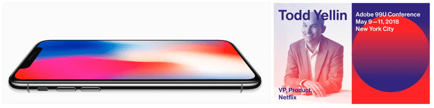 iPhone(left), and 99U Adobe design conference(right)
As everyone was using this effect by the end of 2017, gradients in 2018 are turning into a softer transition. They are not as contrasted as combining red and blue.
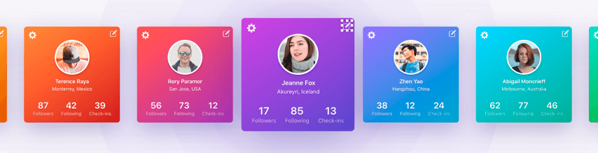 Gradients in Sketchapp.com
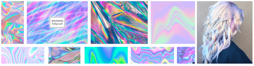
This appeared at the same time marketing campaigns are using the 90s as their aesthetics for two reasons: it is nostalgic for grown-ups who are spending money, and it's appealing for millennials because it is old enough to idealize it. The 90s aesthetic brings us all kinds of revisited holographic materials and backgrounds. We can see this trend in fashion, hairstyles, movie posters, and of course websites.
Another reason for using gradients is because it looks good and beauty is a usability value.
Aesthetic things are often subjectively rated as easier to use, even when no usability advantage can be objectively measure.
Universal Principles of Design, 2003, Kritina Holden et al. More on Aesthetic-Usability effect.
Very opposite color gradients are trendy now but they will look old and overused very soon. That's why we are not using complementary colors, but a transition of analogous colors chosen from our default blue. Here you can learn more about the color wheel and the difference between complementary and analogous.
Conclusion
Not all problems can be solved looking at them with the same level of zoom. Products are alive and their features should be considered as part of a whole. As I mentioned above, design is made in context not in a void.
Maria Munuera
Avocado lover. She would have been born remotely if she could
We think domain management should be easy.
That's why we continue building DNSimple.