How User Feedback Helped Us Redesign Our Account Page
We listened to your feedback and redesigned the account page to better serve your needs. The new design should feel familiar, yet improve on the different tasks that you usually perform on your account. We designed the new page keeping in mind that it should answer these questions:
- What am I paying for?
- What am I paying with?
- How can I stop paying?
These are questions that are often coming through our support channel. We updated the structure of your account page to bring this information to the front and center.
Other tasks were also made easier to achieve:
- Reviewing and editing invoice information
- Changing your subscription plan
- Inviting team members
Overview
We simplified the sidebar to include fewer items. Billing information appears now in the main page. A new automation menu contains everything on webhooks, API tokens, and Oauth applications.
What are you paying for?
The plan section gives you a detailed breakdown of your account plan, extra zones, and email forwards. You can switch your plan from this section.
What are you paying with?
We moved this information from under the billing section and made it easier to scan and understand at a glance. View and edit your credit card details under this new section.

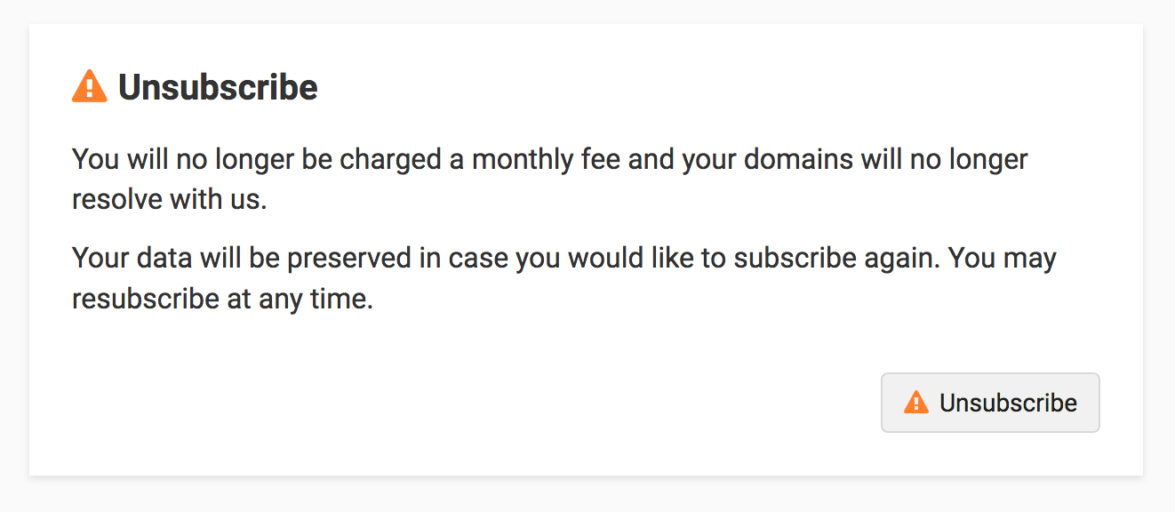
How can you stop paying?
You sometimes need to pause or cancel your subscription. We made it simple by adding this to the bottom of the account page. Scroll to the end of the page and confirm that you'd like to cancel/pause your subscription. You can of course resubscribe at any time.

Other improvements
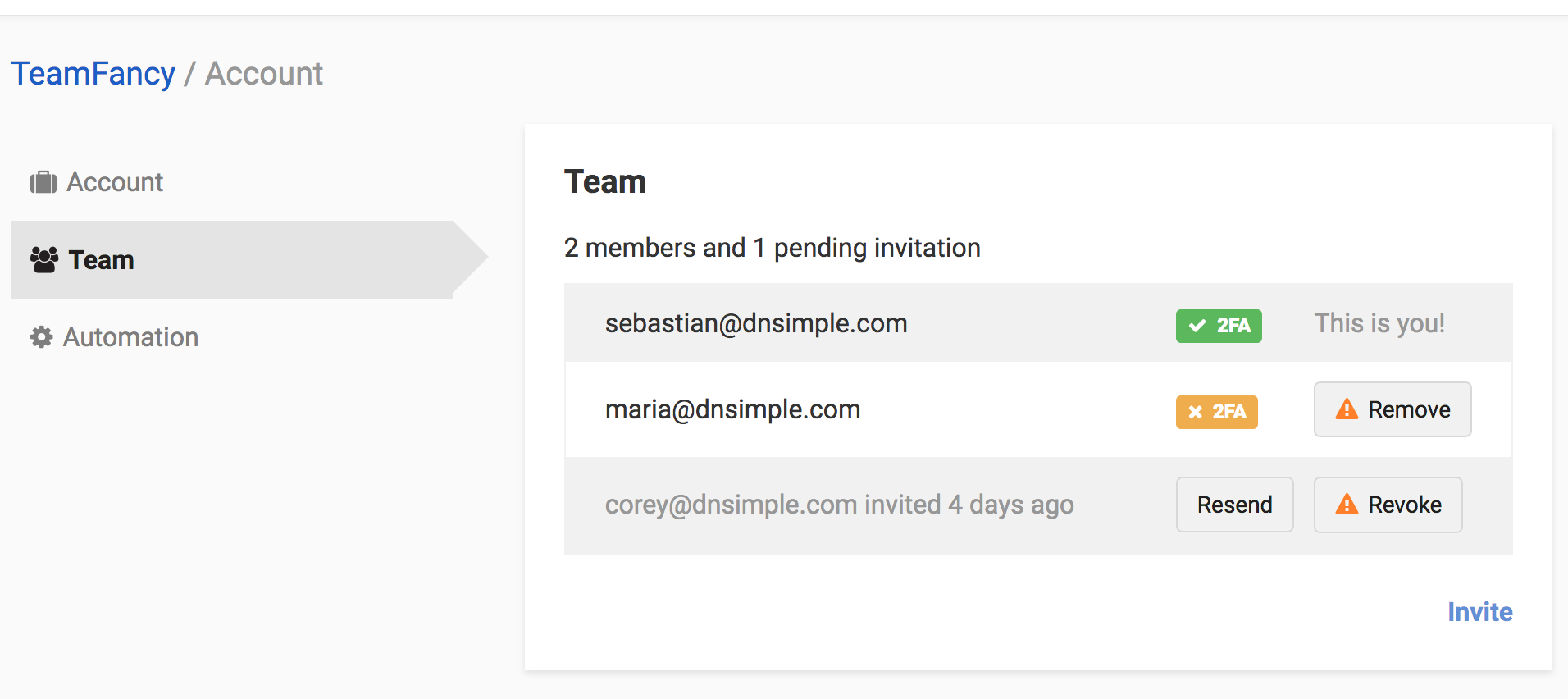
We simplified the team section so it easier to add new members. A few weeks ago, we enhanced this flow so you can invite members without having them sign up for our service first. Have a look at our support documentation for more details about this new process.

Launch and feedback
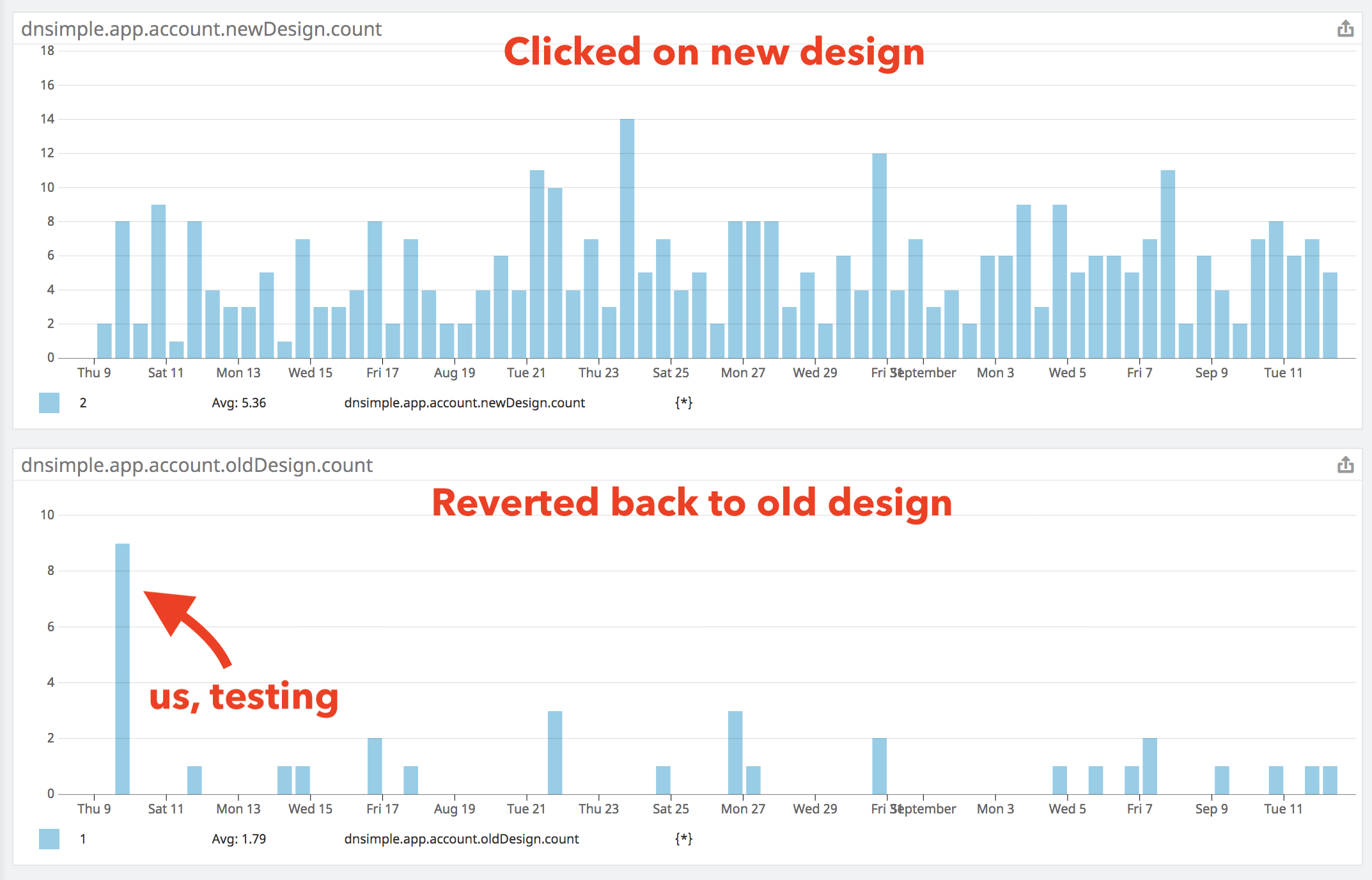
We launched this new design a little bit more than a month ago, letting you switch to it. We monitored the support queue as well as how many users switched back to the previous/old design. We were glad to see that there wasn't a flood of clicks going back to the previous design. After a few weeks observing this trend, we decided to remove the "old" design now.

You might notice a difference in the layout and how things are presented. We took advantage of redesigning the account page to push forward our design system changes that we want to implement across the application.
We hope this new account page helps you better manage your account. If you have any feedback or suggestions, we are all ears. Write us a note at support@dnsimple.com.
Sebastian Hermida
Appreciates the finest things in life: clean code, good illustrations and carrot juice. Someday he will run a marathon.
We think domain management should be easy.
That's why we continue building DNSimple.

