Scaling UIs
In our world, when we usually talk about scaling, we normally refer to infrastructure, processes, or frameworks. But can this apply to UIs? I think so. A UI that cannot fit any more content gracefully is a UI that has problem scaling.
A few weeks ago, we launched a newsletter. Only a few days later, I noticed that we didn't have a link to the newsletter from dnsimple.com. I opened a GitHub issue and started thinking about where to add the new link.
The footer seemed an obvious choice. The link to our blog is already there. I was excited about making this change since reviewing the structure and content of our footer was sitting on my personal "needs ❤️" list.
Here is the footer when the GitHub issue was opened.

The link to the blog is sitting on the left column. The newsletter link shouldn't be far from it. But adding a new link would break the balance of this section. We'll end up with a dangling link sitting all by itself in the last row.
So I started looking for other options, but realized that our footer didn't scale easily to new content. A refactoring was in order.
Asking the footer
- Why am I looking at the footer?
- What problem(s) am I trying to solve?
- What is the job of the footer?
I like these questions because it helps me run through a few scenarios to understand what content should be on any piece of UI.
In the case of the footer, a few answers I came up with:
- I need to jump to a certain page, I am lost. The footer should help me by putting the most important and relevant links up front.
- Something is wrong, I need to contact support. The footer should have a clear way for me to find help.
- I am curious about what you guys are about. The footer should let me explore other content that you provide.
Equipped with these few answers, I started looking at the job at hand.
I need to jump to a certain page, I am lost
Cohesion and coupling are two concepts routed in programming. I continually find them relevant when approaching frontend work.
When programming, we strive for our code to be highly cohesive: elements that are related to each other, belong together. We also seek loose coupling: elements that have little in common are disconnected and far away from each other.
Without the mumbo-jumbo: store your food at a distance from your clothes, and keep the medicine away from the children!
Applying these principles, we can see that the old footer was all over the place. The section on the left had links about the company and product (blog, pricing, blog) mixed with tools like Whois Search and API documentation.
The middle section was a spaghetti of our own terms, policies, and agreements; sprinkled with a couple of ICANN links. Lastly, a link to twitter was detached from the rest and probably claiming too much attention.
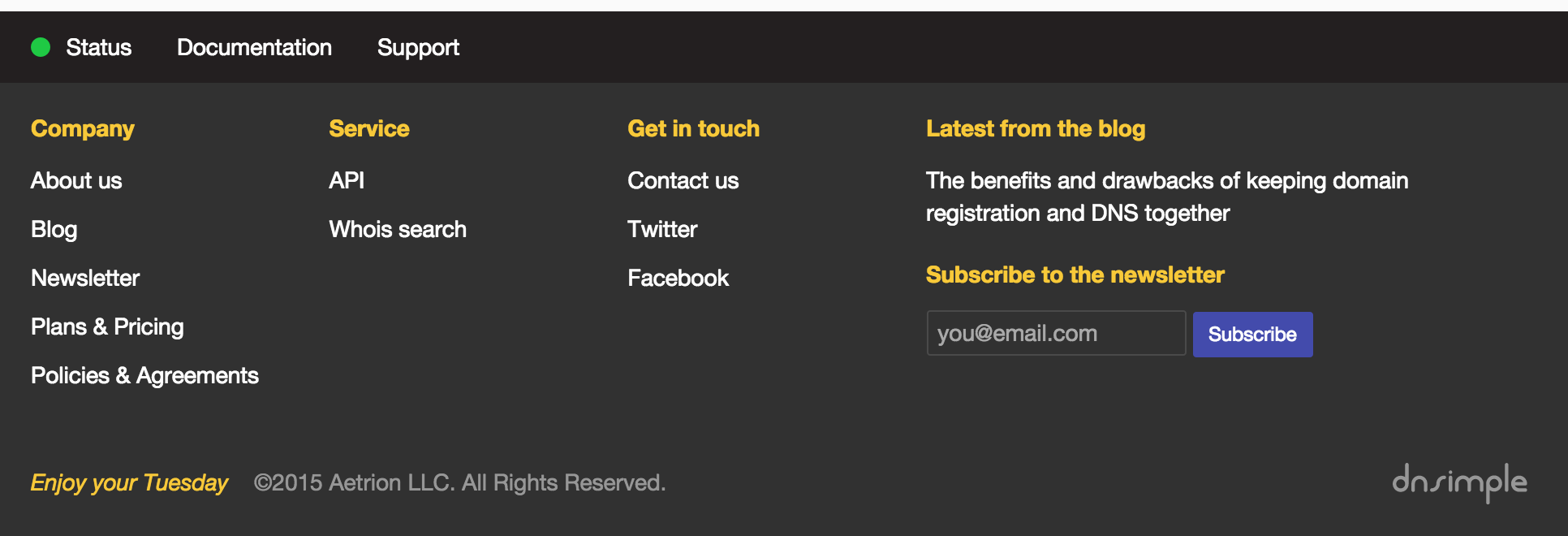
After applying the cohesion and coupling principles, and grouping the links, we now show the most important and relevant links up front to make navigation as easy as possible.
A first iteration applying cohesion and coupling

Something is wrong, I need to contact support
Things will surely go wrong. Servers fail to respond, errors on web pages, confusion, you name it. For this scenario, it could make sense to concentrate all the items related to troubleshooting in the same area.
The section that answers urgent questions like "is this working?", "where are the docs?" and "where can I contact support?"

Hovering or tapping on the status link display a full report of all our systems.
I am curious about what you guys are about
The previous footer had 2 links: about us and blog. We have since then added a newsletter and will probably add a few other things in the near future. By organizing our links, we now have space to tease the latest blog post and display a form to subscribe to our newsletter.

Entropy
Entropy gets his way. Always. But I am hoping that armed with a couple of tools, we can delay and sustain this fight:
- Why I am looking at this UI?
- What problem am I trying to solve?
- What is the job of this UI?
Keep asking the right questions and fold the content where it belongs. Just don't throw everything in the same kitchen cabinet.
Sebastian Hermida
Appreciates the finest things in life: clean code, good illustrations and carrot juice. Someday he will run a marathon.
We think domain management should be easy.
That's why we continue building DNSimple.

