Large redesigns and big rebrandings
I am not a fan of large redesigns or big rebrandings for digital products. The ones that take months or years to roll out where everything (or enough of it) drives people to complain on Twitter.
I appreciate the end result, the case studies, the amount of effort that goes into such endeavor, but when I imagine myself on the project, I don't know if I could pull it off. First, my heart is fragile. I cannot work on a project for months without releasing it. The pressure and stress increases exponentially as the time passes. I prefer to avoid the amount of tension that goes into releasing a big project.
Second, I enjoy showing progress. I have a hard time keeping things a secret. I post progress screenshots on our team's Slack channel, or on GitHub issues, multiple times during the day.
Third, I have a vision, but I need real-world feedback to improve it. Without delivering small chunks of my intuition the symbiosis between feedback and vision is broken. Visions are a bit blurry, but the tiny, immediate couple of next steps in that direction are super clear. This gives me energy to move forward without waiting months for all the pieces to fall together.
For the past few weeks we have been updating sections of our UI that haven't been touched in a long time. The most visible changes are a change of color in the header and footer, a bunch of new flows, and a new logotype.
These are changes that we are making in order to align DNSimple's visual branding with the big features that we are planning to release this year.
Experimentation
One of the core values of DNSimple is being able to experiment with new projects, technologies, and ideas. These experiments often end up with happier customers and smiling employees.
Experimentation allows us to iterate on everything we do. This is why we didn't launch a big redesign, or a huge rebranding. We will be listening to your comments, incorporating it into the vision, and refining it all as we go.
Too many shades of blue
In the process of moving towards a simpler color palette, we were able to remove some old legacy CSS that wasn't very well-written. Hopefully this process has made your experience using the site a bit faster. We continue to clean up the CSS, re-organizing and simplifying sections in the various pages.
This is sometimes scary for our customers. I know we are not Facebook, but updating UIs is something that can really upset people, so we are making sure that we deliver them in small batches and listen to your reactions.
Updates to the logo
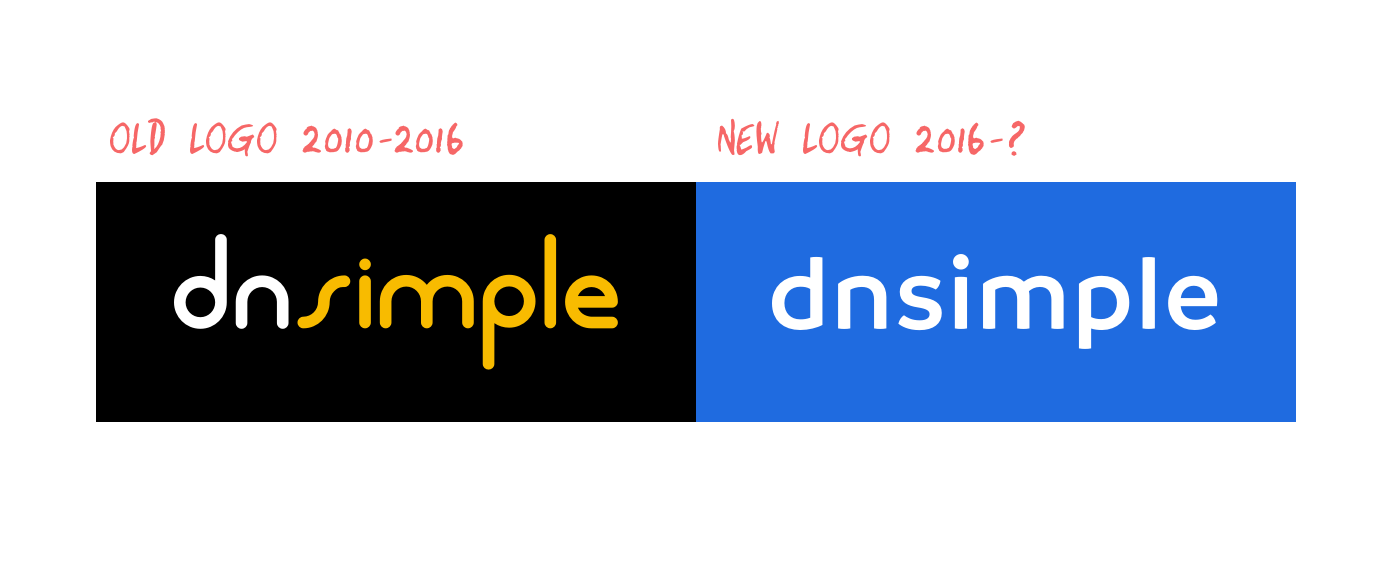
We felt that it was time to refresh our logotype. The previous one had run its course. It did a great job but became particularly difficult to work with.

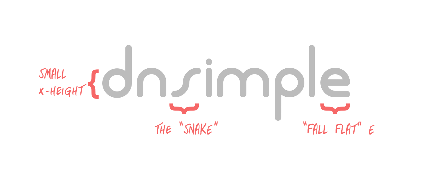
- Hard to read when rendered in small size. The small x-height and chunkiness of the letters got in the way.
- Some characters were particularly strange. The "s", which I kindly called the "snake", didn't fit in.
- The tail of "e" which falls flat while all the other letters have a round structure to them.
- The color: the yellow didn't have enough contrast on light backgrounds.
- The rigidity: the logo could not be placed on a vector path, along the edges of a circle for example.
It's true that the current logo with all of its quirkiness is somewhat memorable, but it still needed a make over.

We started experimenting with a new logotype in February of this year. After producing a few drafts and discussing them, we selected the one above. The process wasn't linear from start to finish. We had a gap of several weeks where no progress was made. This was done on purpose just to let things simmer a bit. A period of inactivity can change, and even improve, your outlook on a project.
The now logotype solves all of my concerns above.
- The round shapes of the old logo are there, but they have been modernized.
- All letters have balance and fit together.
- Works great in small sizes and can be manipulated with no trouble.

Conclusion
The way we work at DNSimple allows us to iterate quickly on our branding and UI design. We avoided a large rebranding and UI redesign process to deliver progress faster, encourage experimentation, and combine reactions from our customers into the final result.
We will continue making visual updates to the app during the upcoming months. I hope we hit the spot for you, and for us. Let us know if you have any feedback.
Finally, if you run into us at any conference, don't hesitate to ask for stickers or t-shirts. This summer, they are going to be fun.
Sebastian Hermida
Appreciates the finest things in life: clean code, good illustrations and carrot juice. Someday he will run a marathon.
We think domain management should be easy.
That's why we continue building DNSimple.

