Refreshing invoices
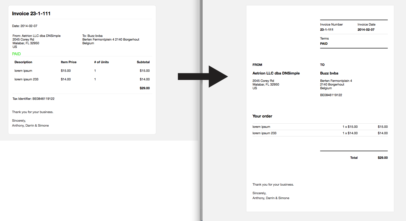
I've been silently working behind the scenes at DNSimple on the design of the app. Recently we migrated from Bootstrap 2 to the latest version, moved over all our icons to use the same library, and made small UI improvements along the way. It's mostly plumbing stuff, necessary but not really visible. Which is what good plumbing should do, work without showing off. Along the way I've also been taking notes about some of the things I'd like to make better. Today I'd like to show you the first visible improvement: cleaner and clearer invoices.
When I'm doing my bookkeeping the look and feel of invoices is something that distracts me from the job at hand, I notice the over use of borders around everything. The lack of typographical differentiation. All of the little details that stick out.
Our invoices were one of those that made me sigh. They were functional, but lacked clarity. So I set out to give them a make over. Inspired by Greg Storey's classic "A better Tighty Whitey" article, it was time to clean up our existing design.
Have a look at this first step, I hope you'll like it.

Hans Verschooten
Reformed conference addict.
We think domain management should be easy.
That's why we continue building DNSimple.

